After testing this palette out for the past few weeks, I’m finally ready to type up a review. Etude House offers two different “shades”:
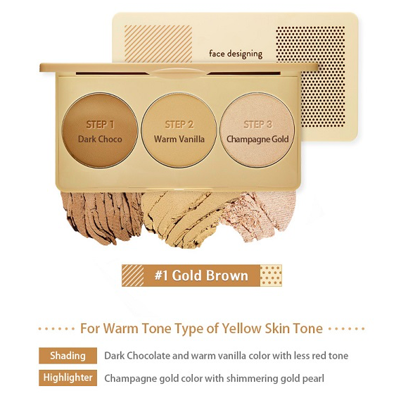
#1 Gold Brown
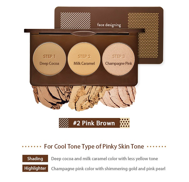
…and #2 Pink Brown
I purchased the Gold Brown because my skin has a lot of “yellow undertone” going on.
It came in a box that looked exactly like the product itself:


The stripes and dots, as well as the title of the palette on the front, have some texture to them when I run my finger over them.

The case is sturdy and feels solid in the hand, and is very compact. I’ve seen highlighter/contour palettes in American drugstores that are bulky and much bigger than this. This feels light and I could easily travel with this. It doesn’t “snap” shut in that satisfying way that some palettes do, but it definitely shuts safety and doesn’t swing open once it’s closed. It also comes with a very nice, large mirror:

The mirror comes with an instructional sticker on where to put which shades on the face. The shades were labeled in Korean with a removable plastic protector:

Here’s a close-up of the instructions on the mirror:

I did initially try to follow the directions on this sticker, but ditched my efforts halfway through the first try. I just would never put a highlight powder on my undereyes and I only use the darker shade for contouring. I love the middle shade for bronzing.


I bought this on a recommendation from the YouTuber Edward Avila, who raved about it in a monthly favorites I believe. I’m so happy I got this, because the shades are just as buttery and smooth as he promised and they blend out SO beautifully.
The shades are named as follows:
- Dark Choco
- Warm Vanilla
- Champagne Gold
Here are some swatches:


They don’t really have a scent at all, and they’re not chalky. There’s no fallout. They don’t get patchy. My brushes pick them up very easily and apply them well. The colors are such a great match for my NC15-20 skin and I just can’t get enough of this palette!
Dark Choco is a more neutral/cool-toned contouring shade on my skin, which I love. Warm Vanilla does just a wonderful job warming up my skin tone if I use a foundation that’s a tad too light for me, and it doesn’t look too orange. Champagne Gold is a lovely peachy/pink highlight with some gold shimmer that’s smooth and not chunky at all.
My previous go-to contour shade was the famous NYC bronzer, which also blends beautifully but pulls very warm on me… but it’s too dark for my skin tone to be used as a bronzer; I pretty much have to use it as a contour shade on my skin. This palette has definitely changed my contouring game and I really can’t get enough of it!
I also really love that they offer an option for both warm-toned skin and cool-toned skin. This palette won’t work as well if you have very dark or very tan skin, though, unfortunately. It is marketed towards the very fair.
I did feature a picture of me wearing this palette on my Instagram, if you’re interested.
I got this palette off of Jolse (see my haul post), and it’s currently priced at $12.78 (prices fluctuate a little bit on Jolse). I’m sure you could also find this on the U.S. Etude House website.
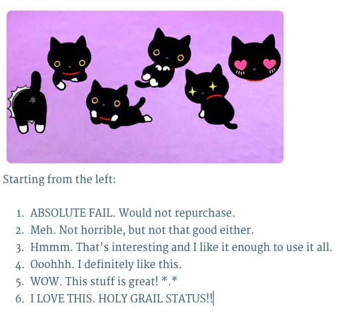
I give this contouring palette a rating of 6/6 – this is definitely my current HG contouring palette and I really enjoy using all of the shades. Such good quality for such a good price!
Here’s my rating scale for reference:
I hope this was helpful! Thanks for reading, and leave a comment below! ❤

Loved reading your in-depth review. Also a bigger lover of Edward. It sounds really wonderful for the price. 😄
LikeLiked by 1 person
Thanks!! I’m glad you liked it and I agree! Edward is so helpful with finding quality products!
LikeLiked by 1 person
Love the rating scale!
LikeLiked by 1 person
Thanks!! O(^▽^)O
LikeLike
I really like the packaging of this – it reminds me of Barbie’s toy makeup for some reason? 😛
But, I’m so glad the product are good quality and the shades look wonderful.
LikeLiked by 1 person
I really wanted to buy this palette. But im cant choose which one whether gold brown / gold pink (i guess). I have fair/medium skintoned. Sometimes mu skin look fair , sometimes look like medium. Can u help me to choose😭
LikeLike
They aren’t different shades, just different tones. The gold brown is for people who have more yellow/golden undertones and the gold pink is for people who have pink undertones. Hope that helps!
LikeLike